

CURATED:
STAFF PICKS
Our staff picks highlight a rotating selection of original artwork chosen
by the Camellia Art team in Hilton Head Island and Bluffton.
Each piece is selected for its composition, presence, and collector appeal,
offering a fresh perspective on new and notable work across the gallery.


TRIO- from SHELL SERIES
I love how Francisco turns these simple, everyday objects into something special. The detail in these shells is incredible, and the soft, neutral colors make this piece feel calm and timeless. It's coastal without being overly beachy. Because this piece is rather small, it would be beautiful and more impactful hanging with other pieces by Casas or similarly styled pieces in a gallery wall. It deserves a quiet wall, where the viewer can approach it to admire the detail as in a powder room or reading area.

MAKE A STATEMENT
The winding road beneath the live oaks feels familiar and nostalgic, like a place you've been before. It captures the beauty and character of the Lowcountry in a really genuine way. But the brightness just around the curve of this dirt road is my favorite part of this piece. not only is it bringing in a whole other spectrum of colors into the piece, but to me it's signaling hope or the promise of something new and brighter. We'd love to see this in an entryway, living room, hallway, or study—somewhere you can enjoy getting lost in it every day.

SPLASH
This piece is full of energy. The movement of the wave and the layers of blues make it feel fresh and exciting. It's one of those paintings that instantly brightens a space. Perfect for a living room, primary bedroom, foyer, or beach house. It makes a statement without overwhelming the room.

Adrianne's June Picks

Suzy's June Picks

WALLY'S ARTICHOKES
This print feels so fresh and bright and completely unexpected as a subject. It's so cheerful and charming so it feels both playful and sophisticated. It would be right at home in a kitchen, breakfast room, or butler's pantry.

SOFT MORNING GLOW
This painting captures one of those quick moments when the world is just beginning to wake up so gently. The soft light reflected across the water creates an immediate sense of calm, making it easy to imagine being there watching the sunrise over a cup of coffee. This would be beautiful in a bedroom, powder room, or quiet reading corner where you want to bring in a feeling of peace and quiet.

COMING UP ROSES
This spoonbill, like most of Heather's subjects, is bright, confident, and impossible not to smile at. The rich pink tones add warmth and life to a space. It's a wonderful choice for an entryway, powder room, or anywhere that could use a cheerful pop of color and a bit of fun.

Mattie's June Picks

A CELEBRATION OF CHAOS
This is brand new to the gallery and one of my favorites of Dottie's yet. This is perfect Lowcountry Summer with the lush greenery, right on the river-- a place that feels like would be visible on any boat ride or on any bridge. I also especially love "the chaos". This painting isn't the gentle, calm spartina marsh and sweeping clouds. This painting is more about the beauty in the Lowcountry's untamed and more rugged places. With it's fairly large size, this is perfect for a living room, dining room, or study.

HEAVENLY
This has been one of my favorite's of Carson's ever since she brought it in. This floral is so fresh, vibrant, and full of movement. The bright colors bring a lightness and warmth that makes this spring or summer day so appealing. Her loose brushwork and soft blend of colors create an uplifting energy that instantly brightens a room. I think this piece would be beautiful in a bedroom because of it's levity and gentle composition.
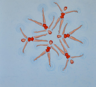
SWIMMING STARS
This piece is so playful and unexpected. I love the contemporary graphic and "pop" elements; the subject matter is perfect for the simple and colorful composition. I love how fun this piece is- it would definitely be a point of conversation in any flex space, indoor porch or pool area, or powder room.
_edited.jpg)
Adrianne's May Picks

GARDEN SERIES I
The loose layers of media create this striking movement through this piece. The soft color shifts and abstract forms bring a sense of life and energy without feeling overwhelming. It’s a great choice for a living room, office, or anywhere you want something fresh and expressive

HAVING A BALL 42
Playful and completely unexpected, this piece has a lighthearted charm that feels full of personality and life. There’s a vintage, almost whimsical quality that I love and her grin keeps me intrigued every time I see it. At 48" x 48", this is quite a statement piece for a guest room, kids room, or anywhere you want something fun and memorable.

MELODY
Kim's marshes are always so eye-catching with their vibrance and hints of hidden color. The textures and layers of color really give this piece a sense of movement- the spartina swaying a bit in the breeze, catching the light and shadows intermittently. It brings depth and a sense of openness to a space while still feeling calm and grounded. This is beautiful for a living room, and even serene enough for a bedroom.
Suzy's May Picks

TENDERNESS
Tenderness by Dottie Leatherwood gives such a peaceful and reflective feeling, like early spring sunrises with its soft warm light. It really makes mornings on the marsh come alive and would be perfect for a bedroom, sitting room, or anywhere you want a sense of calm and stillness.

SWIRLING
The movement in the sky and water feels fresh and full of energy in Marc Hanson's Swirling- like spring air rolling in. It has a lightness that makes a space feel open and energetic. Beautiful for a living room or above a console where you want something uplifting but relaxed.

TURNING HER EGGS
There’s something really special about Turning Her Eggs by Mary Segars. The whole composition of nurturing and new life, paired with vibrant, textured brushwork feels very “Spring time” in the best way. Great for a hallway, office, or a spot where you want a little personality and story.

BEACHWALK LARGE ORGANIC BOWL
Beachwalk Large Organic Bowl by Barbel Brooks is quite the statement. Textural, reflective, and coastal, this piece feels like the beach; so fresh, layered, and full of life. It adds a modern, organic touch and works beautifully on a coffee table, entry console, or as a centerpiece where it can catch the light.
Mattie's May Picks

HORSE PEN ENDING
The soft light and open skies give this piece a quiet, peaceful feel—like spring settling into the marsh. I'm in love with these soft blues and purples; we've seen similar skies in some of Marc's pieces before and they're always my favorites. They bring a sense of stillness and calm and the colors themselves would be perfect for a living room, entryway, or above a couch where you want something serene and expansive.

SUNDAY IN SPRING
Fresh, light, and vibrant, this painting captures the gentle energy that is Spring. The piece is still and calm but lively in colors and textures. This piece would be beautiful in a bedroom, sunroom, or any space that could use a gentle, uplifting touch.

AMERICAN OYSTERCATCHER
I love the boldness of Heather's pieces. I love the refined line and color work that contrasts beautifully against the white negative background she often has. Her pieces are always so moving and elegant. Her portfolio is a great nod to coastal life and in many ways gives us an introduction to wildlife we may not even be aware of, much less get to experience up- close. This piece would be perfect wherever it hangs but definitely needs to be the focal point of the space.

Adrianne's April Picks

WOMAN IN RED
These pieces all have a calm, reflective feel, each in a different way. Berta's Woman in Red stands out for its quiet solitude and use of negative space, making it a beautiful choice for a bedroom or a more minimal, serene space. Sometimes It Takes Darkness by Lindsey Luna Tucker has loose brushstrokes and an unfinished feel at the bottom that adds movement and interest, inviting the viewer in closer. This piece is great for a living room or entry where you want something larger and more expressive.

SOMETIMES IT TAKES DARKNESS
Sometimes It Takes Darkness by Lindsey Luna Tucker has loose brushstrokes and an unfinished feel at the bottom that adds movement and interest, inviting the viewer in closer. This piece is great for a living room or entry where you want something larger and more expressive.

LIGHTING THE WAY
Lighting The Way by Dottie Leatherwood captures everything we love about the Lowcountry. The soft skies and a sense of calm from the warm glow works perfectly in just about any main living space, but definitely deserves to be the main focus of the room.
Suzy's April Picks


If you ever been on the water where you see nature blossom in front of your eyes and then you feel like everything will be ok, that's what I feel when looking at these pieces. All three paintings feel calm and connected, even with bright colors and bold compositions. Andie's pieces are smaller and more intimate, making them great together and perfect for a powder room, hallway, guest space, or anywhere you want something peaceful and easy to look at. Lindsey's piece adds more movement and drama- perfect for an entryway or as a focal piece above a fireplace or sideboard.
Mattie's April Picks


I chose these pieces for their fun personality and color. Ashley's pieces are the newest in the gallery as of me typing this. Her work is always so playful and unexpected. I think they would be perfect for a powder room, kitchen, or anywhere you need something playful and eclectic. The third piece has a softer, more abstract feel with lots of texture, and would work well in a living room, bedroom, or entryway. Together, they all bring a nice balance between bold and accessible.


